The React Mega-Tutorial, Chapter 3: Working with Components
Posted by
on underIn Chapter 2, you wrote your first React component. In this chapter you will delve deeper into React as you learn how to create robust applications by combining and reusing components, not only your own but also some imported from third-party libraries.
The complete course, including videos for every chapter is available to order from my courses site. Ebook and paperback versions of this course are also available from Amazon. Thank you for your support!
For your reference, here is the complete list of articles in this series:
- Introducing the React Mega-Tutorial
- Chapter 1: Modern JavaScript
- Chapter 2: Hello, React!
- Chapter 3: Working with Components (this article)
- Chapter 4: Routing and Page Navigation
- Chapter 5: Connecting to a Back End
- Chapter 6: Building an API Client
- Chapter 7: Forms and Validation
- Chapter 8: Authentication
- Chapter 9: Application Features
- Chapter 10: Memoization
- Chapter 11: Automated Testing
- Chapter 12: Production Builds
User Interface Components
Creating a great user interface for the browser is not an easy task. Styling HTML elements with CSS requires a lot of time and patience, which most people don't have.
As you might expect, a myriad of libraries and frameworks that provide nice looking user interface primitives exist. At the time I'm writing this, there are three leading user interface libraries for React:
I evaluated them and settled on using React-Bootstrap for this book, because it is the most straightforward of the three to learn and use.
React-Bootstrap is a library that provides React component wrappers for Bootstrap, a very popular CSS framework for the browser. You have imported Bootstrap's CSS file in src/index.js in Chapter 2, so some of its default styles are already in use. Now it is time to start actively using Bootstrap elements through the components provided by React-Bootstrap.
The React-Bootstrap library provides grids and stacks as the building blocks to help you create the layout of your website. Grids use the Container component (and optionally also Row and Col) to organize subcomponents. Stacks use the Stack component to render its subcomponents vertically or horizontally within their allocated space on the page. You will use the Container and Stack components later in this chapter.
These two primitives may seem too simple to create complex layouts, but their power comes from their ability to be embedded recursively, as you will soon see.
The Container Component
Go back to the Microblog application you left running in the browser. You may have noticed that the text of the <h1> heading and the two fake blog posts are stuck to the left border of the window, without any margin, and this does not look good. The Container component, which is the main part of React-Bootstrap's grid system, addresses this by adding a small margin around all its children components. The next task is to add a top-level container to the application.
The component's function returns an <h1> element and a list of <p> paragraphs with the contents of the two made up blog posts. All these elements were grouped into a fragment, with the <> and </> tags, because React requires that components return a JSX tree with a single root node. The fragment tags can now be replaced with a <Container> component, which will be the root node of the tree.
Open src/App.js in your editor, add an import statement for the Container component, and then replace the fragment tags with it:
src/App.js: Add a container wrapper to the application
import Container from 'react-bootstrap/Container';

export default function App() {
  const posts = [
    ...  // <-- no changes to fake blog posts
  ];

  return (
    <Container fluid className="App">
      ...  // <-- no changes to JSX content
    </Container>
  );
}
Components in React-Bootstrap can be imported individually, using the format import X from 'react-bootstrap/X'. It may feel tedious to import each component you need individually, but importing the entire library in a single import is discouraged, because that inflates the size of the application considerably.
The Container component has a fluid attribute. A fluid container automatically changes its width to fill the browser window. Without the fluid option, the width of the container "snaps" to one of a few predefined widths associated with standard device screen sizes.
The className attribute is the equivalent of class in plain HTML. The name had to be changed to avoid a conflict with the class keyword from JavaScript. You can use className to provide a CSS class for any primitive HTML element, but many components also implement this attribute and assign it to the top-level element they render. Giving the component a class name is useful to later be able to customize its appearance with CSS. As a naming convention to keep the CSS styles well organized, the name of the component is used as the CSS class.
Save the changes and note how the Container component adds a nice margin to the page. Also try resizing the browser window to see how the container resizes with it. You may notice that the font sizes slightly increase as you make the window larger. Bootstrap styles elements of the page differently for different screen sizes, a technique that helps make websites look their best on phones, tablets, laptops and desktop computers. Figure 3.1 shows how the fluid container looks.

An interesting experiment you can do is to look at the structure of the page in your browser's debugging console. Note how the Container component renders itself as a <div> element with the App class name (in addition to other Bootstrap-specific classes).
For more examples and information about the Container component, consult its documentation. Do not worry if the difference between fluid and non-fluid containers isn't very clear yet. In the next section you will be adding non-fluid containers into the layout, and then the difference will be more evident.
Adding a Header Component
The <h1> element with the application's name was a good first attempt at a header for the application, but of course this application needs something more polished, like a navigation bar that can eventually hold menu options.
To keep the application's source code well organized, it is a good idea to create a custom component for this header in a separate module.
The project as created by Create React App does not provide any guidance on how to structure the source code. I find it useful to put all the custom components of the application in subdirectory dedicated to them. Create this directory from your terminal:
mkdir src/components
React-Bootstrap comes with a Navbar component that is a perfect fit for the Microblog header. Its documentation has a number of examples, which makes it easy to find a design that fits the needs of the application.
Below you can see the Header component, which uses Navbar and Container from React-Bootstrap. Copy this code into src/components/Header.js.
src/components/Header.js: Header component
import Navbar from 'react-bootstrap/Navbar';
import Container from 'react-bootstrap/Container';

export default function Header() {
  return (
    <Navbar bg="light" sticky="top" className="Header">
      <Container>
        <Navbar.Brand>Microblog</Navbar.Brand>
      </Container>
    </Navbar>
  );
}
The component starts by importing any other components that are needed, in this case Navbar and Container. The component function is declared with export default function, because this component is going to be imported from App.js so that it can be included in the page.
The component's function has a return statement that returns a Navbar component, with options that were copied from one of the examples in the documentation. I have decided to use a light background, and I also thought it would be a good idea to make this bar "sticky", which means that when there is a need to scroll, the bar will always stay visible at the top of the page. I gave this component a class name, so that I can then add custom styles for it.
As seen in the Navbar documentation examples, a Container component is defined as a child. A Navbar.Brand component with the application's name is the only thing inside the container for now. React-Bootstrap often groups related subcomponents and makes them attributes of the parent, so you will find many instances where a component uses the dot syntax, as in Navbar.Brand.
This header component shows how layout primitives from React-Bootstrap can be combined and embedded within each other. When this component is added to the page, there's going to be a fluid container as a root element, the navigation bar as its child, and a second container that is not fluid as the child of the bar. This is a good pattern for many applications, because it makes the navbar full width, but its contents are restricted to a narrower, more pleasant width that is chosen according to the screen or window size. The contents of the page will also be wrapped in a non-fluid container so that they align with contents of the header.
Now that the Header component is in the project, it can be imported and used in the App component in place of the <h1> heading. A second inner Container for the blog posts is added as well.
src/App.js: Add header component
import Container from 'react-bootstrap/Container';
import Header from './components/Header';

export default function App() {
  const posts = [
    ...  // <-- no changes to fake blog posts
  ];

  return (
    <Container fluid className="App">
      <Header />
      <Container>
        {posts.length === 0 ?
          ...
        }
      </Container>
    </Container>
  );
}
The Header component is imported from its source file, which is given as a relative path. Then this component is used instead of the <h1> element. Since the component has all the information that it needs to render itself to the page, there is no need to pass any arguments.
As mentioned above, there is now a Container component that wraps the loop that renders the fake blog posts. This is so that the blog posts also use non-fluid positioning, and are aligned with the contents of the header. Figure 3.2 shows how the page looks with these changes.

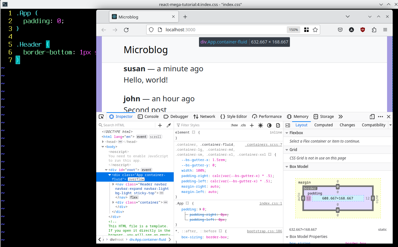
If you look at the header carefully, you will notice that it does not extend all the way to the left and right borders of the window, there is actually a small white margin on each side. Looking at the styles in the page with the browser's inspector I determined that the top-level <div>, which is rendered by the fluid Container, has non-zero padding. The solution to address this minor cosmetic annoyance is to override the padding for this component, which has the App class name.
Another aspect of the styling of the header that I don't quite like is that there is no separation between the bottom of the header and the content area below it. A slightly darker border line there would make the separation more clearly visible.
The src/index.css file is where you will enter all the custom styles needed by the application. Open this file in your editor and replace all of its contents, which were added by Create React App and are not useful to this application, with the following:
src/index.css: Custom styles for App and Header components
.App {
  padding: 0;
}

.Header {
  border-bottom: 1px solid #ddd;
}
With these minor style overrides, the application looks much better, as you can see in Figure 3.3.

Adding a Sidebar
Another common user interface component in many web applications is a sidebar. In Microblog, the sidebar will offer navigation links to switch between the "feed" page, which shows all the blog posts from followed users, and the "explore" page, which shows blog posts from all users.
Looking through the list of React-Bootstrap components, the same Navbar used for the Header component can work as a sidebar, with some small CSS customizations. And the Nav.Link component can be used for the navigation links.
Here is a first implementation of the sidebar, with placeholder links that will not work properly until page routing is implemented. Add this code to a src/components/Sidebar.js file.
src/components/Sidebar.js: A sidebar component
import Navbar from "react-bootstrap/Navbar";
import Nav from "react-bootstrap/Nav";

export default function Sidebar() {
  return (
    <Navbar sticky="top" className="flex-column Sidebar">
      <Nav.Item>
        <Nav.Link href="/">Feed</Nav.Link>
      </Nav.Item>
      <Nav.Item>
        <Nav.Link href="/explore">Explore</Nav.Link>
      </Nav.Item>
    </Navbar>
  );
}
The sticky="top" attribute of this Navbar component will keep the sidebar visible on the page as the user scrolls down. The flex-column class comes from the Bootstrap framework, and has the purpose of changing the direction of its children to vertical. The Sidebar class name is for the application to use when styling this component.
Now the sidebar needs to be added to the page, to the left of the content area. When needing to position two or more components side by side, the ideal layout tool is a horizontal stack. Below you can see the updated App component with a sidebar.
src/App.js: Add a sidebar
import Container from 'react-bootstrap/Container';
import Stack from 'react-bootstrap/Stack';
import Header from './components/Header';
import Sidebar from './components/Sidebar';

export default function App() {
  const posts = [
    ...  // <-- no changes to fake blog posts
  ];

  return (
    <Container fluid className="App">
      <Header />
      <Container>
        <Stack direction="horizontal">
          <Sidebar />
          <Container>
            {posts.length === 0 ?
              ...  // <-- no changes to render loop
            }
          </Container>
        </Stack>
      </Container>
    </Container>
  );
The Stack component was added with the direction attribute set to horizontal, which is necessary because the default for this component is to lay components out vertically. The stack has two children, the sidebar, and an inner Container with the fake blog posts. These two components will now appear side by side, as you see in Figure 3.4.

The sidebar needs some styling work to look its best. Add the following CSS definitions to src/index.css.
src/index.css: Sidebar styles
... // <-- no changes to existing styles

.Sidebar {
  width: 120px;
  margin: 5px;
  position: sticky;
  top: 62px;
  align-self: flex-start;
  align-items: start;
}

.Sidebar .nav-item {
  width: 100%;
}

.Sidebar a {
  color: #444;
}

.Sidebar a:hover {
  background-color: #eee;
}

.Sidebar a:visited {
  color: #444;
}
The definitions added to the Sidebar CSS class are a result of experimenting in the browser's debugging console. Here is a brief description of each rule:
width: 120pxsets the width of the sidebar to 120 pixelsmargin 5pxadds a 5 pixel margin around the sidebarposition: stickyattaches the sidebar to the left side of the browser, so that it stays there when the user scrolls the contenttop: 62pxsets the correct vertical position for the sidebar with respect to the headeralign-self: flex-startaligns the sidebar with the top border of the stack componentalign-items: startaligns the children components of the sidebar to the left
You may be wondering where does the .nav-item class come from in the above CSS definitions. This is a class defined by the Bootstrap library, and used by the Nav.Link component from React-Bootstrap. As mentioned above, opening the browser's developer console and looking at the rendered elements on the page is often the easiest way to find what classes are used and are potential targets for redefining the look of some elements. The CSS definition for .nav-item sets the width of the <Nav.Item> elements to 100%, which means that they will have the maximum width of the sidebar instead of the width of their text. This is done so that the hover style, which alters the background, shows a full bar regardless of the length of the text in the link.
The CSS definitions for a, a:hover and a:visited configure the colors for the links.
With the styling updates, the sidebar looks much better. If you hover the mouse pointer over an item, its background color changes to highlight it. See the current state of the sidebar in Figure 3.5.

Building Reusable Components
A good strategy when building applications with React is to always try to partition the application into many components, each with only one purpose. The Header and Sidebar components from previous sections in this chapter are great models to follow.
The App component is an example of a component that is doing too much work on its own, as it is currently in charge of rendering the general layout of the application, and also the fake representation of what later is going to be the blog feed.
To prepare the application to support page navigation, it makes sense to refactor the App component so that the content area is rendered by a subcomponent that can be swapped out as the user navigates through different pages.
The following listing shows a new component called Posts, with the logic that renders the (currently fake) blog posts. Store this code in src/components/Posts.js.
src/components/Posts.js: Render a list of blog posts
export default function Posts() {
const posts = [
{
id: 1,
text: 'Hello, world!',
timestamp: 'a minute ago',
author: {
username: 'susan',
},
},
{
id: 2,
text: 'Second post',
timestamp: 'an hour ago',
author: {
username: 'john',
},
},
];
return (
<>
{posts.length === 0 ?
<p>There are no blog posts.</p>
:
posts.map(post => {
return (
<p key={post.id}>
<b>{post.author.username}</b> — {post.timestamp}
<br />
{post.text}
</p>
);
})
}
</>
);
}
With this new component in the project, the posts fake blog post array in App can be removed, and the loop that renders it can be replaced with <Posts />. Here is the updated version of App:
src/App.js: Use the Posts component
import Container from 'react-bootstrap/Container';
import Stack from 'react-bootstrap/Stack';
import Header from './components/Header';
import Sidebar from './components/Sidebar';
import Posts from './components/Posts';

export default function App() {
  return (
    <Container fluid className="App">
      <Header />
      <Container>
        <Stack direction="horizontal">
          <Sidebar />
          <Container>
            <Posts />
          </Container>
        </Stack>
      </Container>
    </Container>
  );
}
Components with Props
The App component is still not very flexible. You can envision that once multiple pages are supported, the <Posts /> component is going to be one of many possible options to include in the content area of the page, but with this structure a sidebar would always appear to the left of the content section. The problem is that for this project, the sidebar is only useful after the user logs in.
In this application there's going to be some situations in which the sidebar needs to be omitted, such as when rendering a login page. Since the goal is to keep App as simple as possible, this is another opportunity to move logic down into a new subcomponent.
This new component, which I'm going to call Body, has to be very generic enough to be able to render the main page content with or without a sidebar. It is the first in this application that needs to accept input arguments, which in React are called props.
Before I show you how to write this component, take a look at a couple of examples of this component in use. Here is how the feed page of this application could render the list of blog posts, with the sidebar on the left:
<Body sidebar={true}>
  <Posts />
</Body>
Nice, right? To indicate whether the page needs to show a sidebar or not, a sidebar attribute is given with a boolean value. The contents of the page are given as children of the component, in this case just the Posts component. For a slightly more compact format, you can omit the true value for the sidebar prop, as it is the default:
<Body sidebar>
  <Posts />
</Body>
Implementing a login page using this same Body component could be done as follows:
<Body sidebar={false}>
  <h1>Login</h1>
  <form>
    ...
  </form>
</Body>
Or in a more compact way, you can omit the sidebar prop altogether, which would make it default to a falsy value:
<Body>
  <h1>Login</h1>
  <form>
    ...
  </form>
</Body>
This is extremely powerful, because the Body component becomes the absolute authority on how to format the body of the page, with or without sidebar. If you decide to change the layout of the application in some way, like maybe moving the sidebar to the right side, there is only one place in the entire application where the change needs to be made.
How does a component function access props that were passed as arguments and any subcomponents defined as children? React makes this very easy, because it passes an object with all these attributes as an argument when it calls the component function. The Body() component function can be declared as follows:
export default function Body(props) {
  // props.sidebar is the value of the sidebar attribute
  // props.children is the JSX component tree parented by this component
}
The props object passed into the function includes keys for all the attributes that were given in the component declaration as props. And if the component was declared with children, then a children key is included as well.
In practice, you will find that most React developers use destructuring assignments (see Chapter 1) to receive props. The next example is functionally equivalent to the one above:
export default function Body({ sidebar, children }) {
  // sidebar is the value of the sidebar attribute
  // children is the JSX component tree parented by this component
}
The benefit of this syntax is that the component's function declaration explicitly names its input arguments.
Ready to implement your first non-trivial component? Here is the code for Body, which goes in src/components/Body.js.
src/components/Body.js: A body component
import Container from 'react-bootstrap/Container';
import Stack from 'react-bootstrap/Stack';
import Sidebar from './Sidebar';

export default function Body({ sidebar, children }) {
  return (
    <Container>
      <Stack direction="horizontal" className="Body">
        {sidebar && <Sidebar />}
        <Container className="Content">
          {children}
        </Container>
      </Stack>
    </Container>
  );
}
The JSX hierarchy is the same as it was in App. The parent Container is not fluid, and its purpose is to align the body of the page with the non-fluid container that exists in the header. The Sidebar component is now added inside a conditional, only when the sidebar prop has a truthy value. The second (or only, if sidebar === false) child is an inner Container with the children of the component, which represent the main content of the page. The Stack component is assigned a class name of Body, to help add styles as necessary. The inner Container is given the name Content for the same reason.
With the addition of Body, the App component can be simplified even more. The updated version is below.
src/App.js: Refactored application component
import Container from 'react-bootstrap/Container';
import Header from './components/Header';
import Body from './components/Body';
import Posts from './components/Posts';

export default function App() {
  return (
    <Container fluid className="App">
      <Header />
      <Body sidebar>
        <Posts />
      </Body>
    </Container>
  );
}
You are not going to see any changes to how the application looks in the browser, but this is a very robust and scalable refactor that is ready to be expanded to support multiple pages and the routing between them.
Chapter Summary
- To avoid reinventing the wheel, use a user interface component library such as React-Bootstrap.
- Add a top-level container component that provides sensible margins on all screen sizes.
- To keep your code better organized, create a subdirectory for application components.
- To maximize code reuse, do not add too much to a single component, and instead split the work across several components, each having a single purpose.
- Use props to create components that are reusable.
Ready for next chapter? Here is Chapter 4.
Become a Patron!
Hello, and thank you for visiting my blog! If you enjoyed this article, please consider supporting my work on this blog on Patreon!

-
#1 Russ said
Is there a way to purchase only the ebook version outside of amazon?
-
#2 Miguel Grinberg said
@Russ: No, sorry. The ebook is available from Amazon, or as part of the complete course on my Teachable site. Those are the only two options.
-
#3 Shahrukh said
I'm curious why Posts component is included in the refactored code. I was expecting it to be listed as a prop for Body and the Body component would have then displayed it.
-
#4 Miguel Grinberg said
@Shahrukh: the
Postscomponent is only included in theAppcomponent. It is actually passed toBodyas a prop, React does that indirectly, becausePostsis a child ofBody, soBodygets it as itschildrenprop. -
#5 Daniel said
Hi Miguel
thank you very much for this great tutorial, really useful after your flask one! (spent so much time on the front end!!)
I have a question about the 'key' attribute: I keep having a warning saying that each child should have a unique key prop. I define the key as a unique string in an object called 'link' and my code looks like that:
{AppInfo.header.links.map(link => {
return (
<Nav.Item key={link.key}>
<Nav.Link as={NavLink} to={link.link}>{link.title.toString()}</Nav.Link>
</Nav.Item>
);
Is there something special about how to define this key? -
#6 Miguel Grinberg said
@Daniel: I can't really diagnose the problem from this short snippet, but there is really nothing special about
key, it just needs to be a unique value for each item. You may want to log the key values that you are using to make sure they are notnullorundefined. -
#7 Marcos said
Miguel, nice article.
I've used Vue.js a bit and it's quite ok to mix regular html tags as children of your custom Vue components. I'm newer to Bootstrap but picked up the vanilla non-react version quite quickly.
The question I have is why you chose to use full react-bootstrap components vs just incorporating the vanilla Bootstrap html elements as children of your custom React components? C/Would it have been possible to not use the react-bootstrap components and just use vanilla Bootstrap native html child elements?
Put another way, it seems like many of the react-bootstrap components are only "structural/presentational" and pretty much equal to the original vanilla bootstrap equivalents vs being functional (ie passing real props that deal with state and data of a real app).
So what do we gain by using full on react-bootstrap components for every tag in every child component of the app? It seems to me like we have to learn another abstraction (react-bootstrap) on top of Bootstrap itself where we might have been able to mix vanilla Bootstrap tags in allowing us to leverage what we already know.
It's not a judgement question as I don't know the answer myself. I'm just trying to understand the requirements and benefits of combining vanilla Bootstrap and react-bootstrap together vs going all one way or the other.
Thanks
-
#8 Miguel Grinberg said
@Marcos: The plain Bootstrap library has two parts: a collection of CSS classes, and a collection of JavaScript functions. React-Bootstrap takes the CSS portion of plain Bootstrap and reimplements its JS logic with React components. You can use plain Bootstrap I guess, but you'll either need to create component wrappers yourself, or work with primitive constructs such as
<div>and similar and manually manage your event handlers. -
#9 A said
I have followed the code and process exactly as in the video. Everything works until I add the container, at which point everything on the page disappears instead of a margin being added. Added code below. Any idea why this is happening? Thank you.
CODE:
import Container from 'react-bootstrap/Container'; export default function App() { const posts = [ { id: 1, text: 'Hello, world!', timestamp: 'a minute ago', author: { username: 'susan', }, }, { id: 2, text: 'Second post', timestamp: 'an hour ago', author: { username: 'john', }, }, ]; return ( <Container> <h1>Microblog</h1> {posts.length === 0 ? <p>There are no blog posts.</p> : <> {posts.map(post => { return ( <p key={post.id}> <b>{post.author.username}</b> — {post.timestamp} <br /> {post.text} </p> ); })} </> } </Container> ); } -
#10 Miguel Grinberg said
@A: This is something that you can debug yourself, and then you would be able to figure it out on your own, or at least provide more information so that I can help you. If your page is blank, then you will likely see one or more error messages in the browser's console. That should give you a good indication of what's happening.
-
#11 A said
I've tried but I get very complicated errors and I'm not sure where to start, or sure why this is happening since I'm following the steps exactly.
Before adding the Container to the code, I have no errors when I inspect the console in browser.
When I add the Container like you do, it still compiles successfully in terminal, but I get many errors in the browser console which I do not understand. The errors are as follows:
1:
react.development.js:209 Warning: Invalid hook call. Hooks can only be called inside of the body of a function component. This could happen for one of the following reasons:
1. You might have mismatching versions of React and the renderer (such as React DOM)
2. You might be breaking the Rules of Hooks
3. You might have more than one copy of React in the same app
See https://reactjs.org/link/invalid-hook-call for tips about how to debug and fix this problem.2:
react.development.js:209 Warning: Invalid hook call. Hooks can only be called inside of the body of a function component. This could happen for one of the following reasons:
1. You might have mismatching versions of React and the renderer (such as React DOM)
2. You might be breaking the Rules of Hooks
3. You might have more than one copy of React in the same app
See https://reactjs.org/link/invalid-hook-call for tips about how to debug and fix this problem.3:
react.development.js:1618 Uncaught TypeError: Cannot read properties of null (reading 'useContext')
at useContext (react.development.js:1618:1)
at useBootstrapPrefix (ThemeProvider.js:37:1)
at Container.js:16:1
at renderWithHooks (react-dom.development.js:16305:1)
at updateForwardRef (react-dom.development.js:19226:1)
at beginWork (react-dom.development.js:21636:1)
at HTMLUnknownElement.callCallback (react-dom.development.js:4164:1)
at Object.invokeGuardedCallbackDev (react-dom.development.js:4213:1)
at invokeGuardedCallback (react-dom.development.js:4277:1)
at beginWork$1 (react-dom.development.js:27451:1)4:
react.development.js:209 Warning: Invalid hook call. Hooks can only be called inside of the body of a function component. This could happen for one of the following reasons:
1. You might have mismatching versions of React and the renderer (such as React DOM)
2. You might be breaking the Rules of Hooks
3. You might have more than one copy of React in the same app
See https://reactjs.org/link/invalid-hook-call for tips about how to debug and fix this problem.5:
react.development.js:1618 Uncaught TypeError: Cannot read properties of null (reading 'useContext')
at useContext (react.development.js:1618:1)
at useBootstrapPrefix (ThemeProvider.js:37:1)
at Container.js:16:1
at renderWithHooks (react-dom.development.js:16305:1)
at updateForwardRef (react-dom.development.js:19226:1)
at beginWork (react-dom.development.js:21636:1)
at HTMLUnknownElement.callCallback (react-dom.development.js:4164:1)
at Object.invokeGuardedCallbackDev (react-dom.development.js:4213:1)
at invokeGuardedCallback (react-dom.development.js:4277:1)
at beginWork$1 (react-dom.development.js:27451:1)6:
react-dom.development.js:18687 The above error occurred in the <Container> component:at http://localhost:3000/main.4edf65fba3be39864899.hot-update.js:212:5 at AppConsider adding an error boundary to your tree to customize error handling behavior.
Visit https://reactjs.org/link/error-boundaries to learn more about error boundaries.7:
react-refresh-runtime.development.js:315 Uncaught TypeError: Cannot read properties of null (reading 'useContext')
at useContext (react.development.js:1618:1)
at useBootstrapPrefix (ThemeProvider.js:37:1)
at Container.js:16:1
at renderWithHooks (react-dom.development.js:16305:1)
at updateForwardRef (react-dom.development.js:19226:1)
at beginWork (react-dom.development.js:21636:1)
at beginWork$1 (react-dom.development.js:27426:1)
at performUnitOfWork (react-dom.development.js:26557:1)
at workLoopSync (react-dom.development.js:26466:1)
at renderRootSync (react-dom.development.js:26434:1)'And, as above, here is code:
CODE:
import Container from 'react-bootstrap/Container'; export default function App() { const posts = [ { id: 1, text: 'Hello, world!', timestamp: 'a minute ago', author: { username: 'susan', }, }, { id: 2, text: 'Second post', timestamp: 'an hour ago', author: { username: 'john', }, }, ]; return ( <Container> <h1>Microblog</h1> {posts.length === 0 ? <p>There are no blog posts.</p> : <> {posts.map(post => { return ( <p key={post.id}> <b>{post.author.username}</b> — {post.timestamp} <br /> {post.text} </p> ); })} </> } </Container> ); }Please let me know if any other information would be helpful. Thank you for your help; I feel stuck.
-
#12 Miguel Grinberg said
@A: If you look at the first error, you are given three possible reasons why the error might occur, and a link to learn more about these three possibilities. The error is not from your code, so I would discard option 2 which is about a mistake in your own code when using hooks. The other two options point to a broken installation of the React packages or other dependencies. My guess is that this problem is related to that. You can follow the advice on the linked page to see if you can figure out what the problem is. You can also delete your
node_modulesdirectory and reinstall all dependencies as I show in Chapter 2. -
#13 Alan said
For info, I had a similar error to post #11 above. It turns out that I had not installed react-bootstrap etc. into the project directory, but instead into its parent!. I discovered this by using 'npm list' in the project directory, to find out what I had installed. One correct instal later and all worked. HTH.
-
#14 M4Marvin said
Even after editing the files like you said the right and left blank spaces are still not going away. These are my files
src/index.css
.App {
  padding: 0;
}

.Header {
  border-bottom: 1px solid #ddd;
}

.Sidebar {
  width: 120px;
  margin: 5px;
  position: sticky;
  top: 62px;
  align-self: flex-start;
  align-items: start;
}

.Sidebar .nav-item {
  width: 100%;
}

.Sidebar a {
  color: #444;
}

.Sidebar a:hover {
  background-color: #eee;
}

.Sidebar a:visited {
  color: #444;
}
src/Index.js
import React from "react"; import ReactDOM from "react-dom/client"; import "./index.css"; import App from "./App"; import reportWebVitals from "./reportWebVitals"; import "bootstrap/dist/css/bootstrap.min.css"; const root = ReactDOM.createRoot(document.getElementById("root")); root.render( <React.StrictMode> <App /> </React.StrictMode> ); reportWebVitals(); -
#15 Miguel Grinberg said
@M4Marvin: I don't know what you mean by "right and left blank spaces". The complete code for this tutorial is on GitHub. See the instructions at https://github.com/miguelgrinberg/react-microblog to download the code for this chapter and compare it against your own version.
-
#16 Andriy Utkin said
Removing header padding with CSS didn't work for me.
https://autkin.net/tmp/react-mega-tutorial/Screenshot_20231127_112053.png
-
#17 Miguel Grinberg said
@Andriy: It is possible that you are using a different version of Bootstrap or React-Bootstrap and some details of the CSS implementation are slightly different. You can try adding
!importantto your padding settings to override other competing definitions. -
#18 mort said
i had to add "import 'bootstrap/dist/css/bootstrap.css';" for some of the React CSS to work
-
#19 Miguel Grinberg said
@mort: you should start the tutorial from the beginning. This is covered in the previous chapter.


